The Psychology of Color in Branding
More Than Just Aesthetics: The Science of Sight
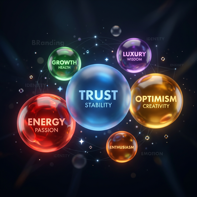
Color is the very first thing a human brain processes when encountering a brand. Long before they read a headline or understand a logo, they have already made an emotional judgment based on your color palette. In 2026, as digital interfaces become more immersive, understanding this 'Subconscious Communication' is the difference between a brand that feels elite and one that feels amateur.
At AD Fusionz, we don't pick colors because they 'look nice.' we pick them based on neuro-aesthetic data. We analyze how specific wavelengths of light trigger hormonal responses—like the release of dopamine or oxytocin—to ensure your brand feels exatamente like the solution the customer is looking for.
1. The Blue Trust Factor and the Tech Hegemony
There is a reason why almost every major tech and financial brand uses blue. It is the most universally 'trusted' color, evoking feelings of stability, intelligence, and calm. However, in a sea of blue brands, how do you stand out? The answer lies in the 'Accent Strategy.'
We use 'Complementary Contrast' to draw attention. By pairing a dominant, stable blue with a high-energy pulse of neon cyan or electric purple, we create a visual hierarchy. The blue builds the trust, but the neon drives the action. This 'Future-Tech' palette is the hallmark of the modern global agency.
2. The Energy of Red: Urgency and Appetite
Red is the color of survival, excitement, and urgency. It physically increases the heart rate and creates a sense of 'Now.' This makes it incredibly powerful for 'Call to Action' buttons and flash sales. However, too much red can create 'Visual Anxiety,' leading a user to click away from the site.
We use red as a 'Precision Tool.' Like a surgical strike, a splash of red against a sleek dark-mode background acts as a powerful guide for the eye. It tells the user exactly where the most important information is without overwhelming their senses. It's about 'Strategic Vitality.'
3. Luxury and the Power of 'Negative Space'
In high-end branding, the absence of color is often as powerful as its presence. Black and deep charcoal palettes signify sophistication, authority, and exclusivity. When paired with metallic accents like gold or silver (created via advanced 3D shaders), it creates a 'Premium Weight' that consumers immediately associate with higher price points.
We specialize in 'Dark-Mode Global Grade' designs. By using deep gradients and subtle glassmorphism, we create depth without clutter. This 'Minimalist Luxury' aesthetic is what separates global-scale brands from local competitors. It shows the customer that you don't need to scream for attention because your quality speaks for itself.
4. The 60-30-10 Rule: Designing for Balance
To ensure a palette works across every device and state, we follow the 60-30-10 rule. 60% is your dominant neutral (often a dark charcoal in our designs), 30% is your secondary brand color, and 10% is your 'Action Accent.' This proportion ensures that the user's eye is never lost and that the most important information—the 'Buy' or 'Contact' button—is always the clearest thing on the screen.
This balance is critical for accessibility. We test every palette against AAA contrast standards to ensure that your brand is readable and resonant for everyone, regardless of their visual abilities. Good design is inclusive design.
Conclusion: Painting Your Path to Growth
Choosing your brand colors is one of the most significant business decisions you will ever make. It is the 'Vibe' that precedes the 'Value.' By combining psychological research with high-end digital artistry, we help our clients create palettes that don't just look beautiful—they feel undeniable.
AD Fusionz Team
Growth Strategists & Creators