Motion Design: The Secret Sauce of Next-Gen UX
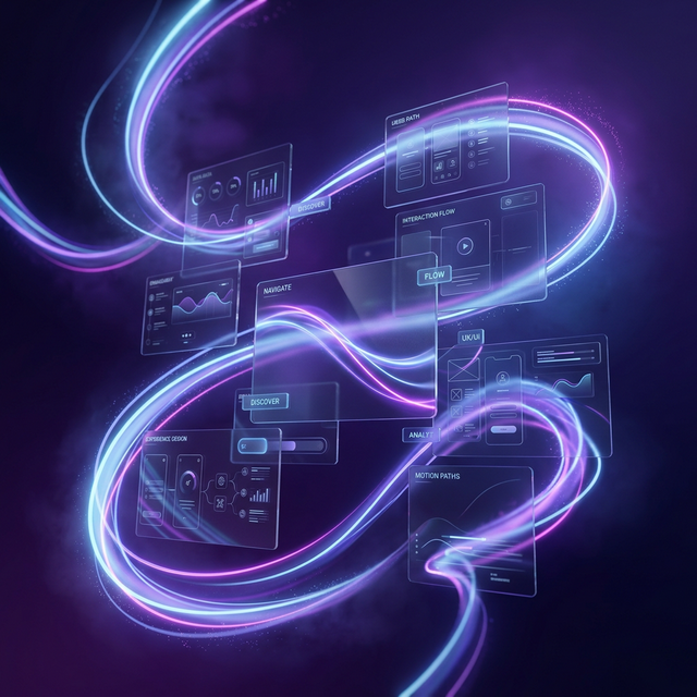
Bringing the Interface to Life
The days of static, 'dead' websites are over. In 2026, the internet is alive. Users now expect an interface to react to them—to acknowledge their movements and reward their curiosity. This is the domain of 'Next-Gen UX,' where motion design isn't an afterthought, but a core functional requirement. Motion is the 'Body Language' of your brand.
At AD Fusionz, we use motion to guide the user's eye and reduce 'Cognitive Load.' When an element moves logically, the user doesn't have to think about what to do next; the interface tells them. This creates a sense of 'Flow' that keeps them on your page longer and increases the likelihood of conversion.
1. Visual Hierarchy Through Directional Animation
Human eyes are evolved to notice movement first. By using subtle 'entrance' animations, we can dictate exactly which part of the page a user looks at first. A heading that slides in smoothly from the left or a button that gently pulses attracts attention without being intrusive.
This is 'Attention Engineering.' Instead of overwhelming the user with everything at once, we reveal the story of the page piece-by-piece. This 'Staged Entrance' ensures that the user actually reads your value propositions instead of just skimming over them. In design, timing is just as important as layout.
2. The Science of Micro-interactions: Feedback Loops
A micro-interaction is a small, functional animation—like a button changing color when you hover over it, or a checkout icon bouncing when you add an item to your cart. These small moments are 'Gratification Signals.' They confirm to the user that 'The system heard you, and it worked.'
We spend hours refining the 'Easing Curves' of these interactions. A 'linear' animation feels robotic and cheap. An animation with 'Natural Easing'—where it starts fast and slows down gracefully—feels expensive and organic. It's the difference between a basic app and a 'Global-Grade' experience.
3. Narrative Motion: Telling the Brand Story
Great design tells a story, and motion is the transition between the chapters. We use 'Scroll-Triggered' animations to create an immersive experience. As you move down the page, 3D elements rotate, backgrounds shift, and text appears in a way that feels like you are exploring a digital world.
This 'Interactive Narrative' is incredibly powerful for building emotional connection. It turns a boring 'About Us' page into a cinematic journey. When a user is 'playing' with your website, they aren't just a visitor; they are a participant. Participants are much more likely to become advocates.
4. Managing Performance: The Need for Speed
The biggest challenge with motion is performance. A website that is 'alive' shouldn't be 'slow.' We use high-performance libraries like Framer Motion and GSAP, and we optimize our 3D shaders to ensure that even a complex animation runs smoothly on a 3-year-old smartphone.
We follow the 'Performance-First' animation rule: if it doesn't run at 60 frames per second, we don't use it. 'Janky' motion is worse than no motion. By optimizing our code and assets, we provide a premium experience that feels lightning-fast and incredibly fluid.
Conclusion: Designing for Delight
Motion design is the final layer of polish that makes a website feel truly 'premium.' It is the 'Magic' that turns a collection of images and text into a living brand entity. By embracing the power of movement, you are signaling to your customers that you care about every millisecond of their experience. In the future of UX, the best interface is an interactive one.
AD Fusionz Team
Growth Strategists & Creators